Layout study · 7 October 2026
100 photos. Four different ways to tell the story.
A collection can feel like a travel journal, a gathering of moments or a single piece of patterned artwork. Here, the photographs stay the same. The arrangement changes what you notice first.

One collection, four compositions
These four examples each contain the same 100 distinct landscape and outdoor photographs, used exactly once per layout. Mountains, water, open skies and distant people give us both wide views and small subjects to compare. Every page is A3 landscape: 420 × 297 mm.
Stickerloom’s production analysis, layout, framing and export libraries generated this artwork. These are not editor screenshots. Automatic content-aware assignment can place a photograph in a different slot for each style, so compare the overall treatment as well as individual pictures.
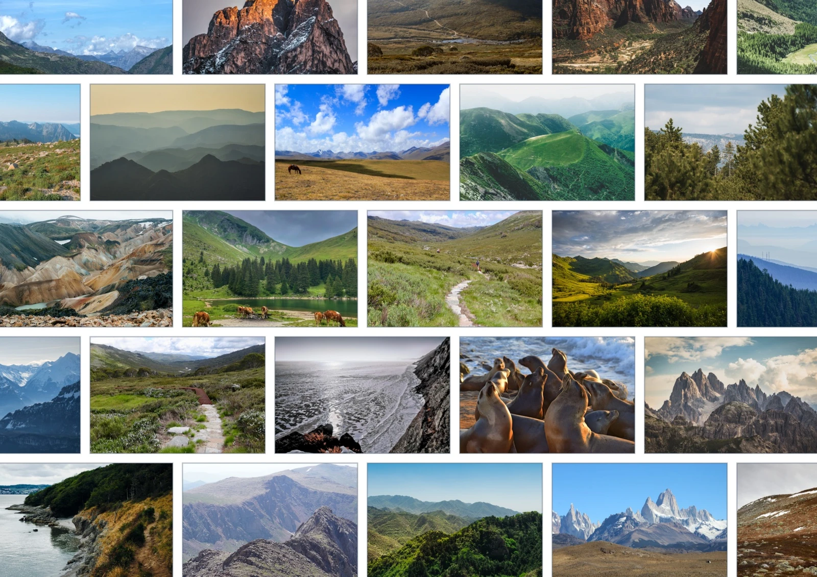
Brick: give each view a little room
Brick keeps the collection readable as rows of individual pictures. Its staggered rhythm breaks up the strictness of a grid, while rectangular frames give horizons and mountain ranges a familiar setting. Choose it when the photographs themselves should lead: a holiday recap, a walking club collection or a page you want people to browse one image at a time.
A wide frame accommodates more landscape context, but still crops a portrait-shaped source. Check details near the edges, especially people who are small within a larger scene.
Sunflower: make the collection feel gathered
Sunflower spreads circular frames into a rounded composition. The white space between pictures gives each moment its own boundary, while the whole set reads as a cluster. It suits collections where colour and atmosphere matter more than a row-by-row reading order: a season outdoors, a group’s favourite places or a visual mood board.
We requested 30 mm circles with a 2 mm gap. The planner fitted this arrangement to the page, so final frame sizes can differ from the request. Circles trim corners: review the subject inside the shape as well as the uncropped photograph.

Classic Spiral: let the eye follow a path
Classic Spiral also uses circles, but places them along a single spiral path. Look from the centre outward and the composition feels more directional. Choose it when you want the page to invite a wandering look, with a centre and an outer sweep, rather than presenting photographs in rows.
This example began with the same requested 30 mm circles and 2 mm gap and was fitted to the page. Automatic assignment means the path should not be assumed to preserve a timeline. If chronology is essential to your story, inspect the resulting order before treating the spiral as a sequence of events.
Compare this outward path with the Sunflower arrangement above, then review both full pages before choosing.

Honeycomb: turn separate views into a mosaic
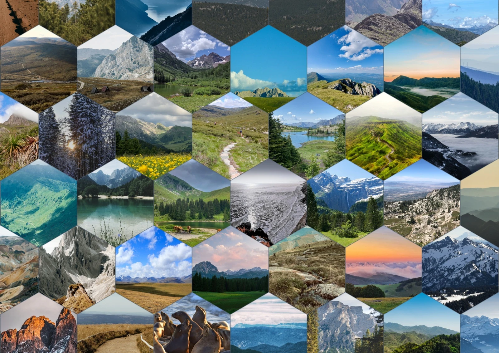
Honeycomb brings hexagonal frames together with a requested 30 mm size and zero gap. The photographs become a continuous patchwork of blues, greens and stone. Choose it when the collection should make an impression as a whole, then reward a closer look. Its shaped perimeter is part of the composition.
The joined edges make cropping especially visible: a skyline can meet a neighbouring image, and corners disappear into the hexagon. Review the detail below before deciding that every photograph works in this shape.

Choose the story, then check the details
Start with the reading experience you want: individual views in Brick, a rounded gathering in Sunflower, a centre-out path in Classic Spiral or a connected mosaic in Honeycomb. Then check the full page and the individual crops. Automatic framing helps make a starting composition; it does not guarantee that every small face or landscape feature will be prominent.
These source photographs are 1080-pixel-wide derivatives. A larger export cannot restore detail absent from them, so these previews are not a promise of sharp giant prints. Use suitable originals and review at your intended output size. For ideas beyond this comparison, explore creative photo collections.
About these examples and photo sources
The photo credits and licence record lists all 100 original stock-photo source URLs and licence links. These credits describe the examples shown here, not a downloadable stock-photo library.
Geometry checks found no page overflow or measured frame-contour collisions. Sunflower retained eight minor tight-spacing warnings and Classic Spiral one. Those checks do not replace visual crop review.